
Students all over my school are striking for climate action and I’m not sure what to do. I definitely support their actions, but I also think that learning Algebra is critical to understanding our climate crisis.
I created a lesson on changes in the rate of global petroleum consumption over time as a way to introduce them to the wonders of the online graphing software Desmos (and as a way to educate them on our consumption rates.)
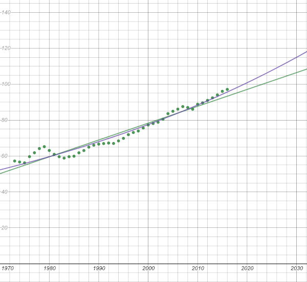
I got all of the data online from the U.S. Energy Information Administration website here.
The green dots are the data. The green line is a linear regression (using a line to model the data.) The blue line is an exponential regression (using an exponential curve to model the data.) There are quite a few great questions this graph can generate about the data and the lines that potentially model our future behavior.
The lesson worksheet is here:
And here’s a link to the completed Desmos graph.
I’m still not sure whether I’ll run this lesson today (when many of my students may be striking) or next week when I’m guaranteed a full captive audience. The good/bad news is that the climate crisis is not going to be a quick fix, so I’ll have many future opportunities for this education.
